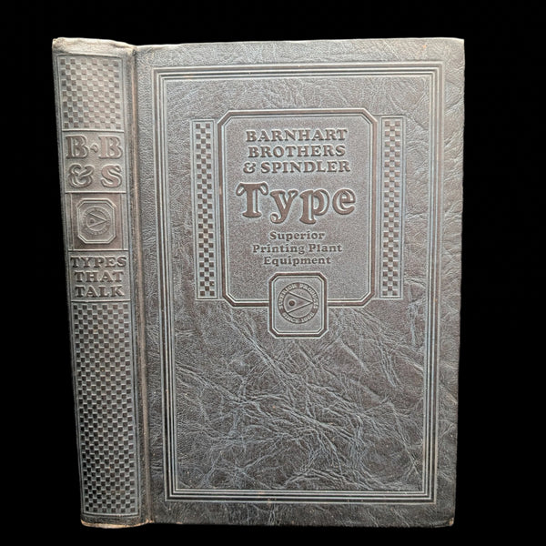
Types That Talk: Catalog of Type Faces by Barnhart Brothers & Spindler (RARE), c. 1920s 🖨️🎨✒️
1. Introduction 📜🔍🏛️
This is a cornerstone work on the art of typography and graphic design. This catalog, a crucial resource for printers, showcases a vast array of metal typefaces, borders, ornaments, and brass rules. As an undated, circa 1920s publication from Barnhart Brothers & Spindler, this volume is a highly sought-after artifact for collectors of design history and early Americana.
It is a tangible time capsule, preserving a crucial moment in the history of printing before the advent of digital technology. This edition is a window into the aesthetic sensibilities and the very roots of modern graphic design. Its historical significance and detailed content make this a premier acquisition for any serious library.
2. About the Book 📖✍️✨
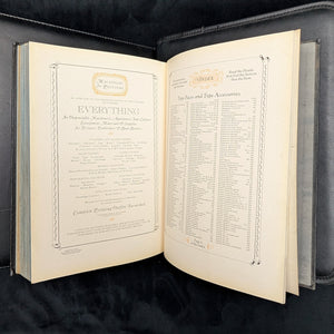
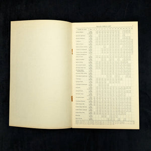
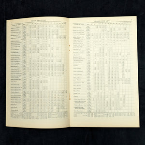
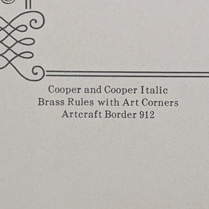
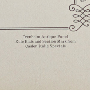
This catalog is a comprehensive visual compendium, filled with detailed examples of hundreds of distinct fonts, from classic serifs to whimsical scripts. Each typeface is displayed with meticulous attention to detail, showing its various sizes and uses.
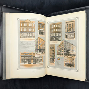
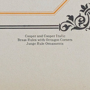
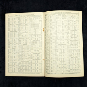
Beyond the typefaces, the catalog's extensive collection of decorative elements, known as "typecast ornaments," provides an incredible resource for understanding the graphic design trends of the Roaring Twenties. These ornaments, in essence early clip art, were used by printers to add decorative elements to their work.
The book is an essential primary source for any scholar or dedicated reader of printing and design history. Its contents reflect the aesthetic and technical possibilities of the era, from bold and modernistic advertising types to intricate, delicate borders. The catalog itself is a work of art, designed to showcase the beauty of the products it sold.
3. About the Author/Maker ✍️🏛️
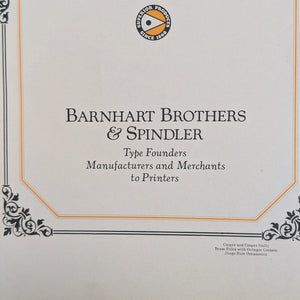
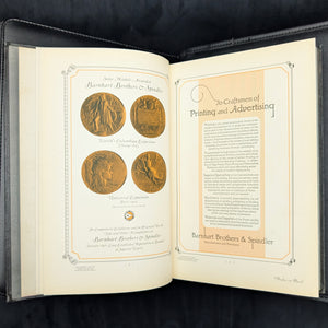
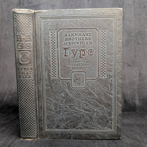
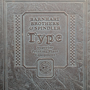
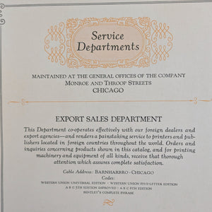
Barnhart Brothers & Spindler was one of the most important American type foundries of the late 19th and early 20th centuries. Founded in Chicago in 1869, the company was known for its innovative type design and well-designed type catalogs. They were a successful foundry with a reputation for quality craftsmanship and a wide variety of typefaces, many of which were original designs.
The company was acquired by the American Type Founders (ATF) in 1911, but continued to operate under its own name until 1929. Their catalogs are prized today for both their historical value and their beautiful examples of classic typography.
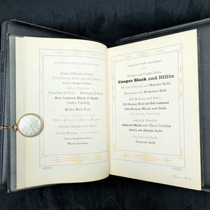
Many of the typefaces they created, such as Cooper Black, have had a lasting impact and continue to be used in design today. This book showcases their dedication to their craft and their commitment to providing high-quality tools for a burgeoning industry.
4. Historical/Political Era Context 🌍🕰️📜
Published in the c. 1920s, this book is an artifact of a period of immense change in American culture and design. The era saw the rise of modern advertising, Art Deco, and a new kind of visual sophistication.
As the demand for printed materials exploded, so did the need for diverse and eye-catching typefaces. This catalog represents a vital link in the chain of design history, showing the tools and aesthetics that defined an entire generation of printed works, from elegant letterheads to bold posters.
The book is a "time capsule" of early 20th-century American commercial art. It captures the spirit of an era when mass communication and print media were at their peak.
5. The Ideal Collector 💡🧐🏛️
This book is intended for a curator of graphic design history, a scholar of typography, or a private collector of Americana. It is an ideal acquisition for an individual who values a book's dual significance as a foundational historical document and a physical artifact of a specific era.
This is a perfect fit for a typography collection that cherishes a tangible link to a craft and an industry that has largely disappeared. It appeals to a collector interested in the intersection of art, history, and the craft of printing.
The book is an essential piece for an individual building a library that tells the story of graphic design, typography, and marketing literature. It is not just for display, but for a reader who is serious about understanding the evolution of visual communication.
6. Value & Rarity 💎✨🏛️
As a rare vintage catalog, this book represents a genuinely scarce, non-replicable asset class. As a commercial sales tool, these catalogs were not intended to be preserved. They were used heavily in print shops and often discarded, making surviving copies in good condition exceptionally rare.
The book is a unique window into the history of a lost craft. The price is a direct reflection of the book's rarity, its historical significance, and its superior condition. The book's value as a scholarly document and a physical artifact makes it a strong acquisition. Its true worth lies in its historical context and its scarcity within the specialized field of typographical history.
This is a unique and non-replicable asset class that is unlikely to reappear on the market for years to come.
7. Condition 🔎📚✨
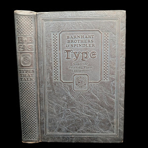
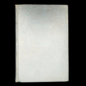
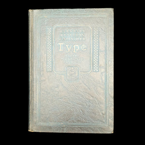
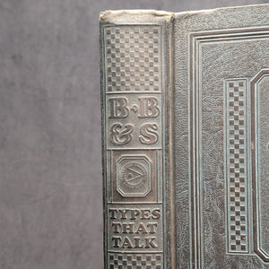
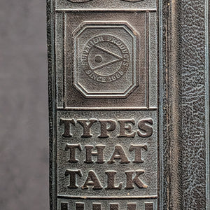
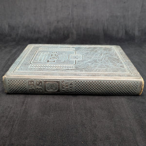
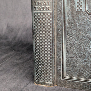
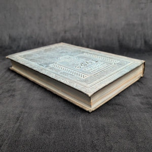
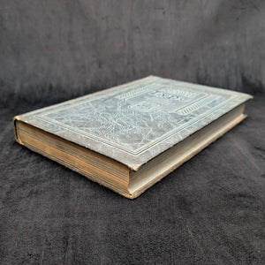
This volume is a handsome survivor from the c. 1920s, showing honest and authentic wear consistent with its age. The original decorative cloth cover shows some rubbing and scuffing, particularly along the edges and on the spine. The binding remains solid and tight, though it shows some signs of use and age.
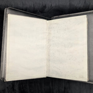
The pages have some expected toning and light foxing throughout, a natural process for paper from this period, which gives it authenticity. The pages are free from any major tears or stains, and the interior text block is clean.
The book is free of any detached or loose pages. There are no major marks or previous owner's scribbles, making this a pristine copy for a book of its time.
The book has been well cared for over the centuries and remains a functional, readable object. Its preservation is a powerful indicator of the high regard in which it was held by its previous custodians.
8. Translation of Inscriptions/Ephemera (Conditional) ✍️📜🔤
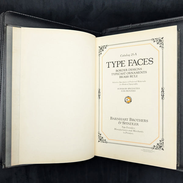
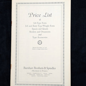
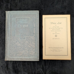
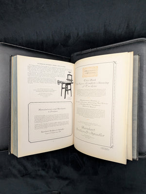
This book contains no known inscriptions or unique markings from a previous owner. The value is derived from its well-preserved state as an authentic piece of early 20th-century American bookmaking. Its beauty lies in its original state, unmarred by the personal history of its past owners. The book is accompanied by a loose-leaf paper attachment, a unique piece of ephemera. This attachment likely served as an update, a new design, or a price list that was meant to be added to the book by hand.
9. Fun Facts & Unique Features 🤓📜🤩
-
Many of the typefaces displayed in the book, such as their classic "Cochin" font, have been digitized and are still used by designers today.
-
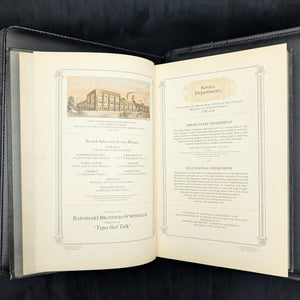
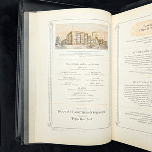
The company’s motto was "Types that Talk," a clever phrase that encapsulates the power of good typography to communicate a message.
-
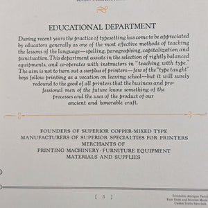
The catalog's copyright page features an "Educational Department" that describes how the practice of typesetting was being used to teach spelling, grammar, and capitalization.
-
Barnhart Brothers & Spindler won medals at the World's Columbian Exposition in Chicago in 1893 and the Universal Exposition in Paris in 1900.
10. Supporting Information 🏷️📦💰
-
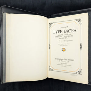
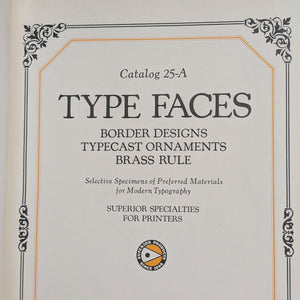
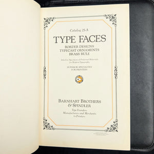
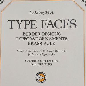
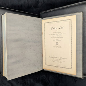
Title: Type Faces, Border Designs, Typecast Ornaments, Brass Rule, Catalog 25-A
-
Author/Maker: Barnhart Brothers & Spindler
-
Year: Undated, c. 1920s
-
Publisher/Foundry: Barnhart Brothers & Spindler
-
Place of Origin: Chicago, IL, USA
-
Format/Binding: Hardcover, Original Decorative Covers
-
Edition: First Edition
-
Rarity: Rare